We were given a free-hands project as a course assignment. The goal was to get familiar with cross-cultural design methods and get some first-hand experience. Our multi-cultural team of four took this as a challenge and worked passionately towards a common goal.
Fugenjikko - action before words - is a Japanese concept that lead my team into designing an app that reinforces & teaches sustainable and ethical habits for Japanese people.
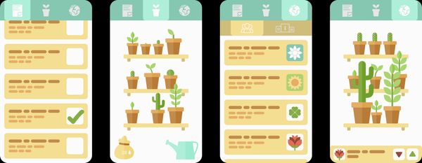
Sustainability is not a task that you can complete; it's a lifestyle or culture of constantly improving your habits and perception of what's sustainable. Fugenjikko offers sustainability in bite-size tasks and rewards the user with seeds - in-game currency. The app is new to the market but offers a task list that can be modified the users of whichever area it's released. Fugenjikko relies on the garden metaphor and the real-life effects of the app are reinforced with slight gamification features.
Objectives
Getting familiar with the concepts of Cross-Cultural Design
Design an app to promote ethical actions and sustainability
The main focus of the project was in Cross-Cultural Design and choosing the focus culture was a straightforward task due to our team having mutual interest in Japanese culture for various reasons; anime, tea, technology, robots, and philosophy. The project was initiated by the team of four browsing internet for anything related to Japanese culture and behaviour. We looked at both cultural things and visual aesthetics.
We decided to utilise cultural probes to get more familiar with the culture. The probes we chose were a photomontage and notebook task since we considered them easy enough to conduct within the given time and resources. Hofstede’s model and country comparison were our starting points for designing the probes.
For presenting our findings and reporting our progress, we built a story around Asimo - a high-tech robot - trapped in a busy city seeking peace. With this narrative, we were able to convey the extremes of Japanese culture quite effortlessly.
We recruited four people affiliated with the aforementioned culture for our user studies: three Japanese exchange students and one Finnish student who had studied in Japan for a year. The assignments, done with Miro boards, were given with a deadline, and an interview date was set to discuss about how the participants did the assignments. This was to fill all the gaps we as designers could not understand.
The interviews were planned to be as comfortable to the participants as possible. This, however, had to be done based on our assumptions about what we learned about Japanese people and their ways of thinking in the quick initial research. Nonetheless, we faced challenges. In the interview, it was apparent the participants weren't willing to talk about certain topics.
Based on the cultural probes and the follow-up interviews, we wrapped up the findings into a single persona.
The idea we started working on was to find ways of incorporating actions promoting ethical and sustainable behaviour to daily life. To get people act differently, some kind of a rewarding system was necessary. Also, the actions should be taken in real life. Hence, through rounds of brainstorming, we came up with the idea of an app with a task list and collectibles as a reward.
Additionally, our target users love competition and peace simultaneously, a gamified app where user does real-life tasks to grow their virtual garden seemed like a logical solution. A leaderboard system was created with the idea that it could increase the amount and quality of actions of the users. However, we decided to add that touch of harmony by basing the leaderboard on the beauty of your garden and not only the tasks you accomplish. This way we managed to create a balance between performance and peace.
I made us a little plant kit to make it easier to create various plants
Garden metaphor was quickly chosen as the core of the design. I took the lead in visual design based on the research done together. Since Japanese adore games with cute graphics, soft colours and simple shapes were used in the design. Thusly, a simple but good-looking prototype was created in Figma.
Having only a little time for testing, we did another round of interviews. The interviews were kept short and focused heavily on the app and what the participants thought of it. 4/4 said they would definitely give it a try and "this is what Japanese need". One of the Japanese was expecting us to continue the work and implement the app. We unfortunately had to tell it will only stay at a concept level.
The concept got into a good-level level prototype but, unfortunately due to the lack of resources, we had to part our ways with it. Moreover, we had no time for iteration and, in its all simplicity, the prototype didn't really need testing.
Screenshots of the prototype
To conclude the concept and showcase the prototype, I made a concept video about it. Of course, to make a full circle, this too was tied to the story of Asimo.
Cross-cultural design is hard. We all have lots of biases, and stereotypes guide our thinking. In this project, it became apparent to me that what I've learned, no matter how objective I think it is, is never unbiased. For example, I thought I knew what Japanese discipline means but now I can say for sure I only have a good guess what it means.
It's not only abstract things that are heavily culture-dependent; even colours are too. I'm happy we decided to proceed with such a natural colour palette since colours have vastly different connotations in different cultures. A good example for Westerners is that, in Japan, pink is considered a masculine colour. Let that sink in for a while. However, there is a certain type of harmony in how Japanese use colour in design. I cannot really put it into words nor say I grasp it, but I think I've noticed something characteristic to Japanese culture.
Colour palette used in the Fugenjikko prototype
Now I know how little I know. Or no, I don't even really know that. But at least I've gained some consciousness on why it is important to set your biases and assumptions aside as a UX designer. First, however, you need to acknowledge what biases and values might affect your views and thinking.