Project Overview
Challenge
This project addresses the design challenge "Reading articles on the go" by UXchallenge. Flow is designed especially for those who commute by public transport or bicycle. This project was designed by the designer duo Blackfish Design and the design process was originally shared as a blog post.
Our solution handles caters a selection of articles from different lists and ensures an interruption-free reading or listening experience. With Flow's unique interruption-handling algorithm you won't miss any parts of articles. Additionally, Flow offered us an opportunity to utilise GPT in the design workflow.
Objectives
- Staying up-to-date with your reading list
- Handle or mitigate interruptions
- Extra: Experiment with utilising AI in the workflow"
Project Scope
HTI Research and Innovation, Hi-Fi Prototype
Role
UX Designer, UX Researcher, Visual Designer
Team
Self-directed
Tools
Figma, FigJam, Gen-AI, GPT
Duration
6 weeks
Design Process
Background Research
Before diving into any design work, it's crucial to conduct background research to understand existing knowledge and solutions. This background research helps us build a strong foundation for effective design solutions. We conducted background research from the literature review and the benchmark study.
Vadas' research suggested that audio is an acceptable modality for mobile devices while reading on the go as it is less demanding than reading. Accordingly, Pocket is a good example that applies this theory into practice; it is a read-later app that allows users to turn articles into podcasts so they can listen to articles. The effect of noise and hard-to-read font couple contribute to boosting concentration while reading.
In addition, we found some excellent examples for the read-later list. Alfread is an app which categorises articles by tags, allows users to set reminders for reading, celebrates each completed article when users finish reading and encourage users to set realistic reading goals. Pocket shows the number of saved and read articles, which is an interesting approach to tell users directly the difference between what they wanted to read and what they actually read. Instapaper offers a speed reading mode that displays a summary of an article so that users can quickly catch up after being distracted.
User Research
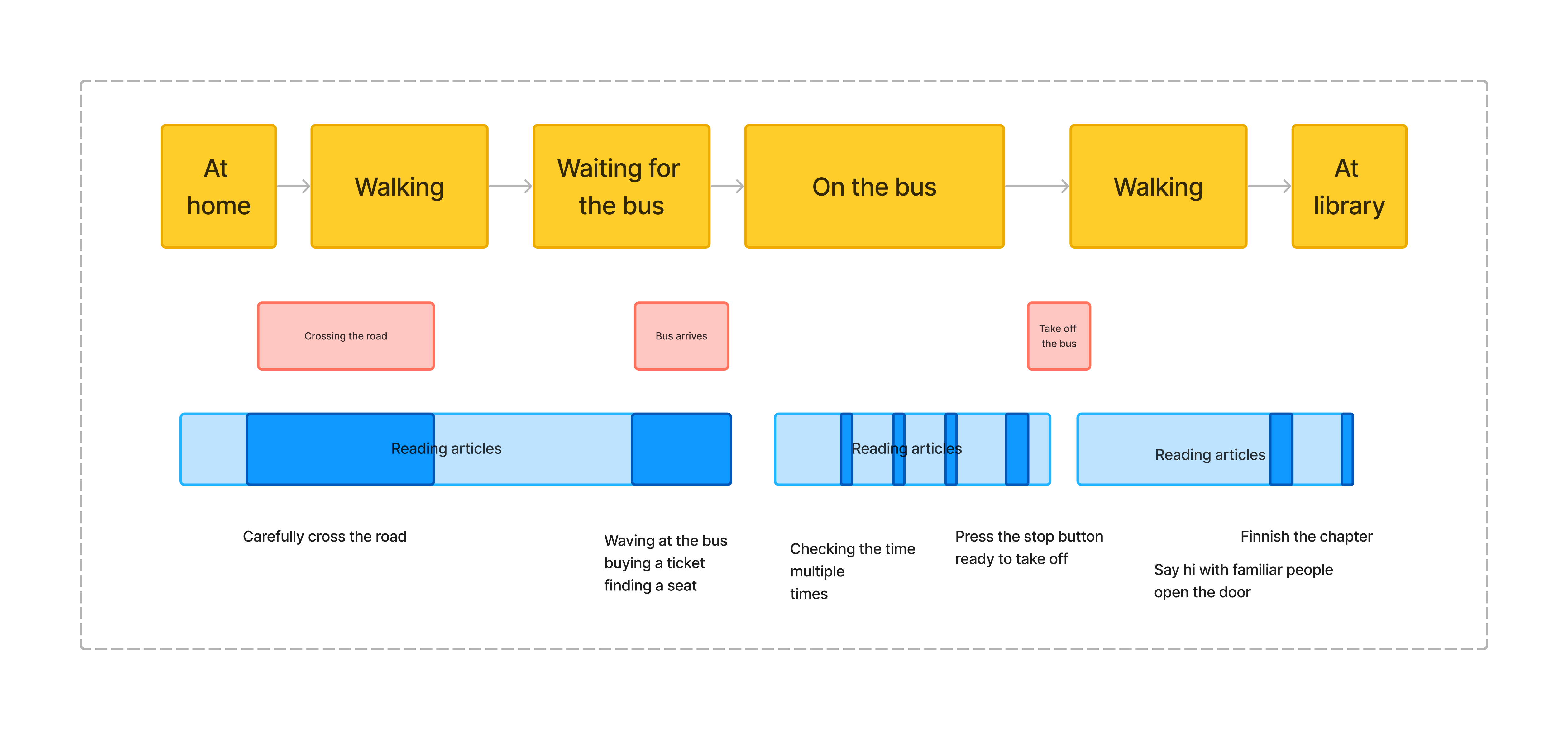
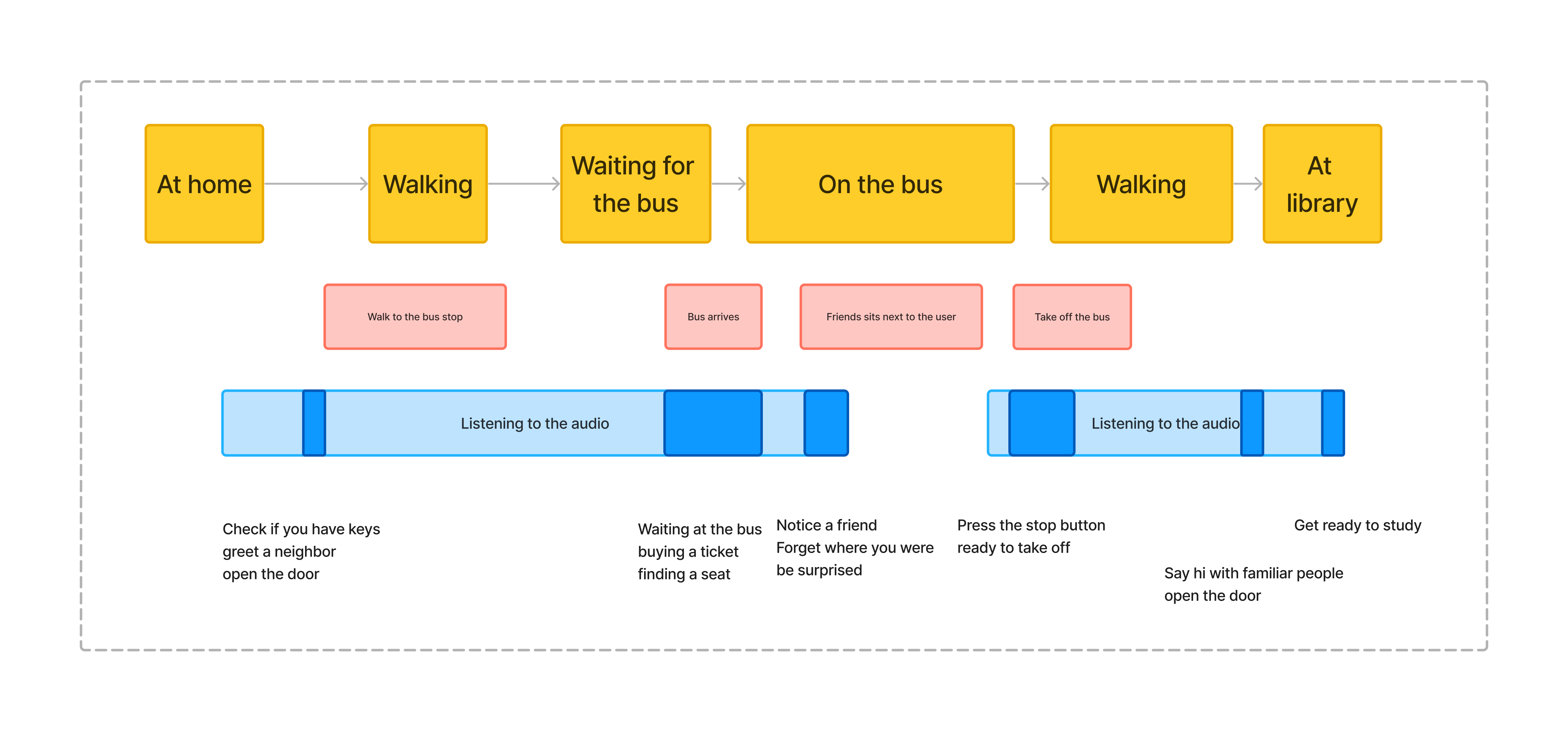
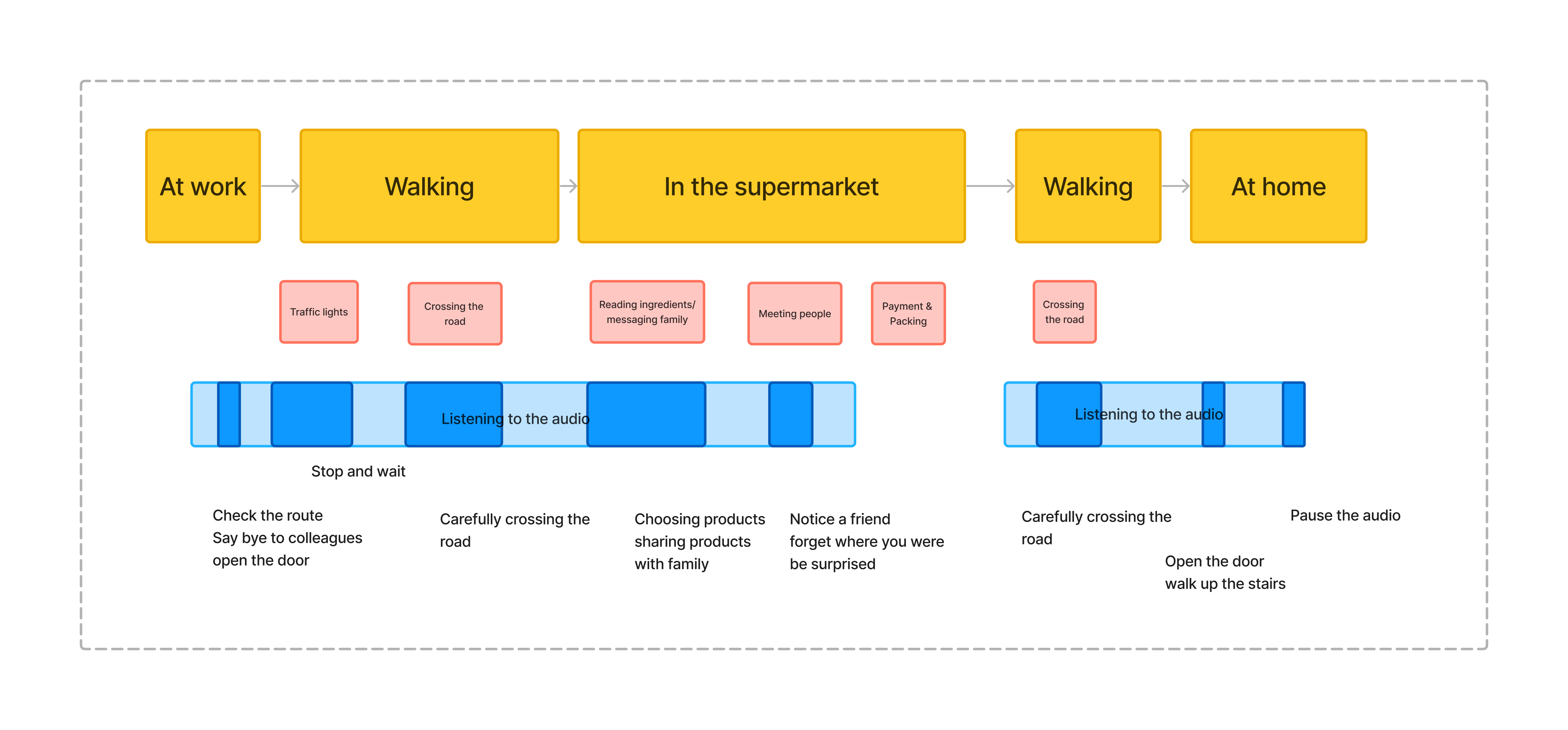
During the user research phase, we started with defining the end user groups. We defined someone being “on the go” as they are constantly moving around and without continuous time devoted to reading. There are four types of moving in this case, first, people are listening to articles while walking or bicycling; second, people might use noise-cancelling headphones to listen or read an article while they use public transportation; third, people expect to listen when they are driving; fourth, people willing to read when they are on the train. Considering the safety and the fragmented time under those situations, we defined people who walk/bicycle and use public transportation as our end users. Reading or listening to articles while driving seems too dangerous behaviour and we don't want to accidentally promote reading while driving; we want to prioritise the safe options first. For the people on the train, they usually have more complete reading time so they are not that relevant end users.
After defining the end user groups we mapped out the user journeys to help us understand their needs, goals, frustrations, and pain points. Based on the two user groups, below are our journey maps.
To create a User-Centred Design (UCD) and understand users' requirements and behaviour, an online survey was created to collect data related to reading articles on the go. Several demonstration questions were asked to understand users' backgrounds which might affect their reading habits, like age groups, education level, and professional fields. This is followed by the reading habits to analyse their behaviour, for example, the frequency of reading, when they will read articles and the motivation or reason to add articles to read later. Then the survey asked how they will use the read later list and what frustrations exists during their use. In the end, potential suggestions for this project were asked to assist in design decisions. We posted the online survey on LinkedIn to attract participants but, unfortunately, we didn't get enough responses from the survey. Since the timeline of this project, we decided to embrace GPT with an open mind.
GPT is an effective tool in UX design for generating personas and responses based on the prompt. To get the response to the survey, we created a prompt to create a persona and answer questions based on this persona. In the prompt, the context was provided and the GPT's first request was to create a random persona, and then play the role-playing game that GPT was the person who had just been created. Furthermore, generating survey responses brings some benefits, to begin with, GPT is good at generating suggestions for specific content, which provides us with a broad horizon. Second, GPT might generate multiple backgrounds based on its database which increases the diversity of data, it could be considered as a benefit rather than only getting responses from a specific range of people. To give an example, the researchers post surveys in their social circle which might get responses from people with similar backgrounds.
However, the application of AI has two drawbacks in this case. Firstly, researchers must screen all answers to understand their means and manually fill out the survey. Since the survey contains some scale questions, the prompt and the response are just text. Secondly, we found that GPT will generate similar personas, so we changed to a new conversation for each response to reduce this bias. All in all, we acknowledge the bias in the results but it gives a good baseline for the design phase. In the future, this data should be supplemented with real user data.
This is the prompt we used in our user research with GPT:
I’m doing user research on the topic “reading articles on the go”. Could you create a random persona? Let’s play a game where you’re that person and I’m the researcher. Could you answer these survey questions: [survey questions here]
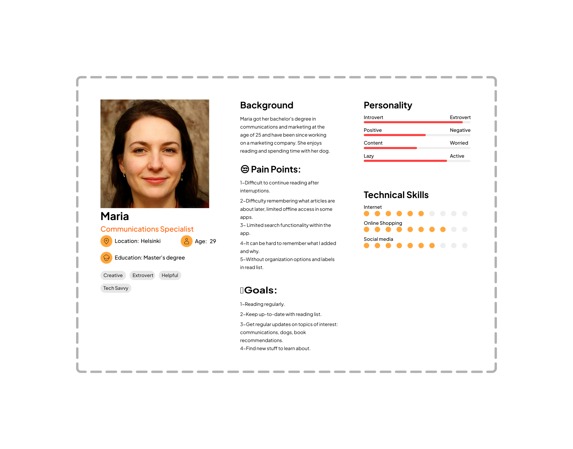
As a result, a persona was created based on the generated data analysis. Maria is an extrovert communication specialist, she would like to read regularly and catch up quickly after interrupting. The image was generated by thispersondoesnotexist.
Design & Prototype
We split the design phase into three parts: ideation and brainstorming, MVP wireframing, and hi-fi prototyping. This separation helps you to stop in between and really reflect back on your work. For us, it meant that wireframing and prototyping were done individually but discussed together in the meetings.
Ideation
The ideation part consisted of doing card sorting on the ideas that sprung from the surveys. The ideas were grouped into themes which acted as a basis for our brainstorming. We continued to brainstorm features on top of the existing ideas. At this stage, we didn’t explicitly decide to drop gamification and reading environment categories but they didn’t sprout any ideas. Afterwards, all these cards were again sorted into groups forming the scaffolding for the sitemap.
MVP wireframing
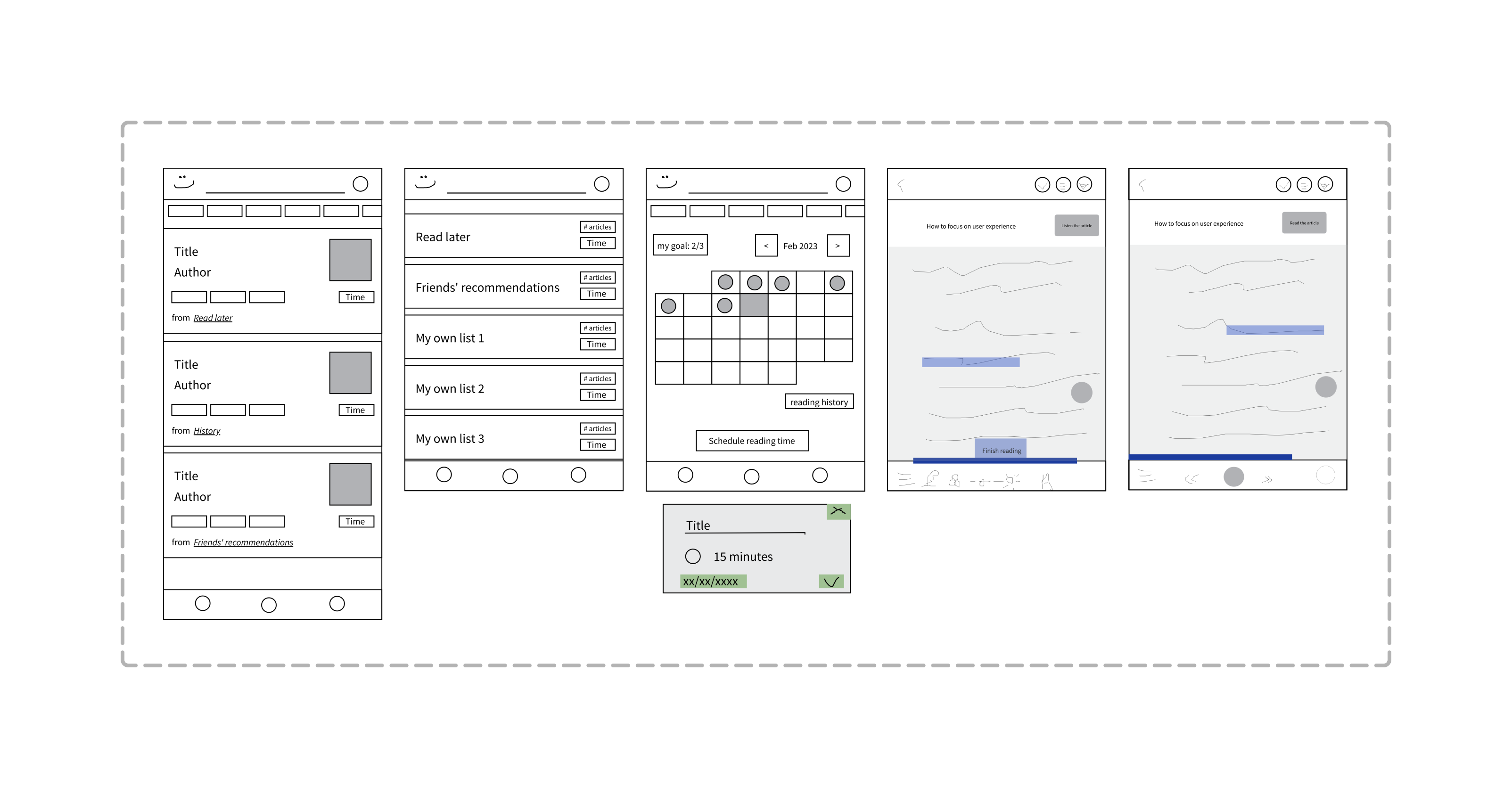
Next up was deciding on the MVP solution and creating wireframes. This process started by creating a sitemap based on what we came up with in the ideation phase. We focused on making sure each feature gets put into the sitemap. It was clear the sitemap contained way too many features and it needed to be pruned a little to fit into the scope of our project. Reflecting on our design prompt, we moved the nice-to-have features aside creating the MVP sitemap. However, we had to make one assumption to better focus on our task: we decided to focus only on what happens after an interruption, not how to detect one.
Before drawing any wireframes we took time finding existing apps and websites with similar features we had in mind. We focused on finding individual components that could fit our app rather than copying an existing app. Based on the MVP sitemap and the aforementioned wireframing inspiration we drew the first key wireframes individually. We noticed one major difference in the user flow of the wireframes — both having their pros and cons — but decided to create a hybrid wireframe containing the best of both worlds.
HI-FI prototyping
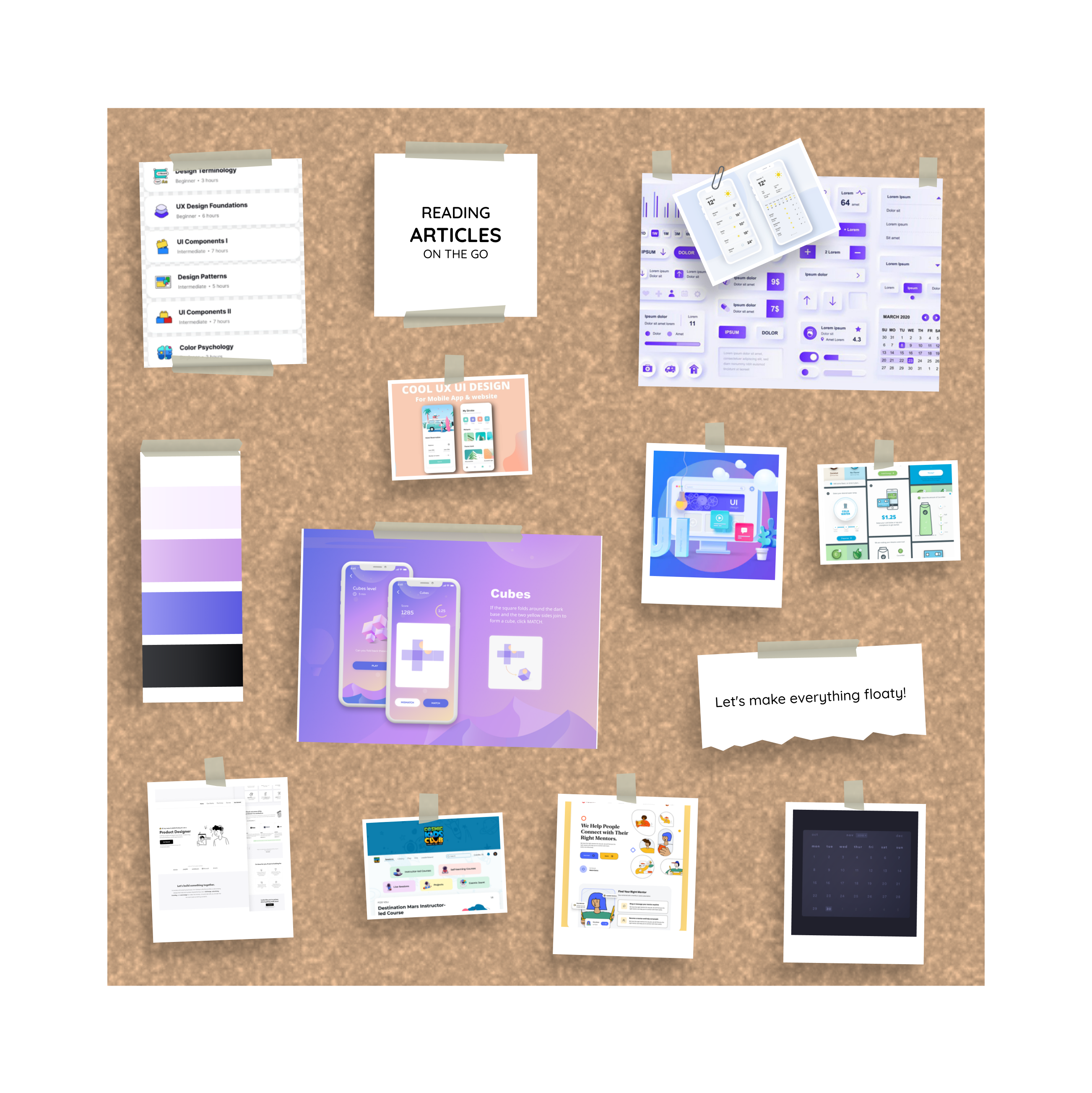
Now that the outlines of the app are clear we needed design inspiration for the visuals. We spent some time looking for existing apps and websites that have the aesthetics we're after. Fortunately, we had a mutual understanding of what our app should look like. We organised the images into a moodboard using this template to spark inspiration. Additionally, we agreed on the style and colour palette. Following the best practices of Figma, we spent time creating reusable components, variables and style attributes from scratch to use in our prototype. This way it's easy to make changes in the future or keep adding features.
Interactions were part of our design challenge so naturally, we handled the interactivity of the prototype with care. The basic interactions were straightforward but the interactions regarding the handling of interruption demanded more effort. We tried slightly different approaches and discussed them and ultimately landed on what we considered relatively simple interactions on the reading page.
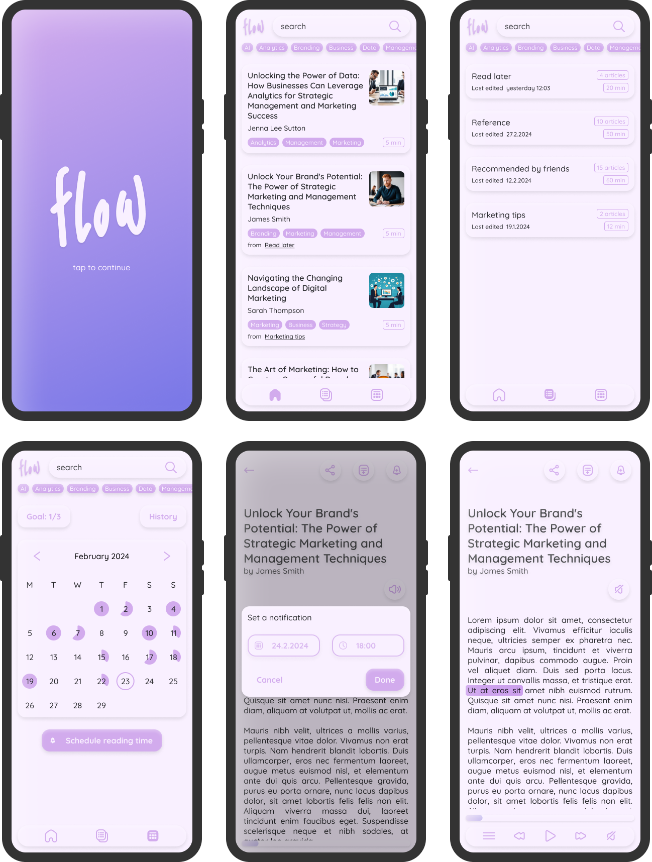
At this stage, our prototype still looked like a skeleton because of the emptiness of the components. We decided to summon GPT to our help once again and used it to generate article titles, author names, and article images for the app. To get as realistic output as possible we included our persona in the prompt as well. We used a Figma plugin called Cube GPT to inject AI-generated output into various text layers simultaneously.
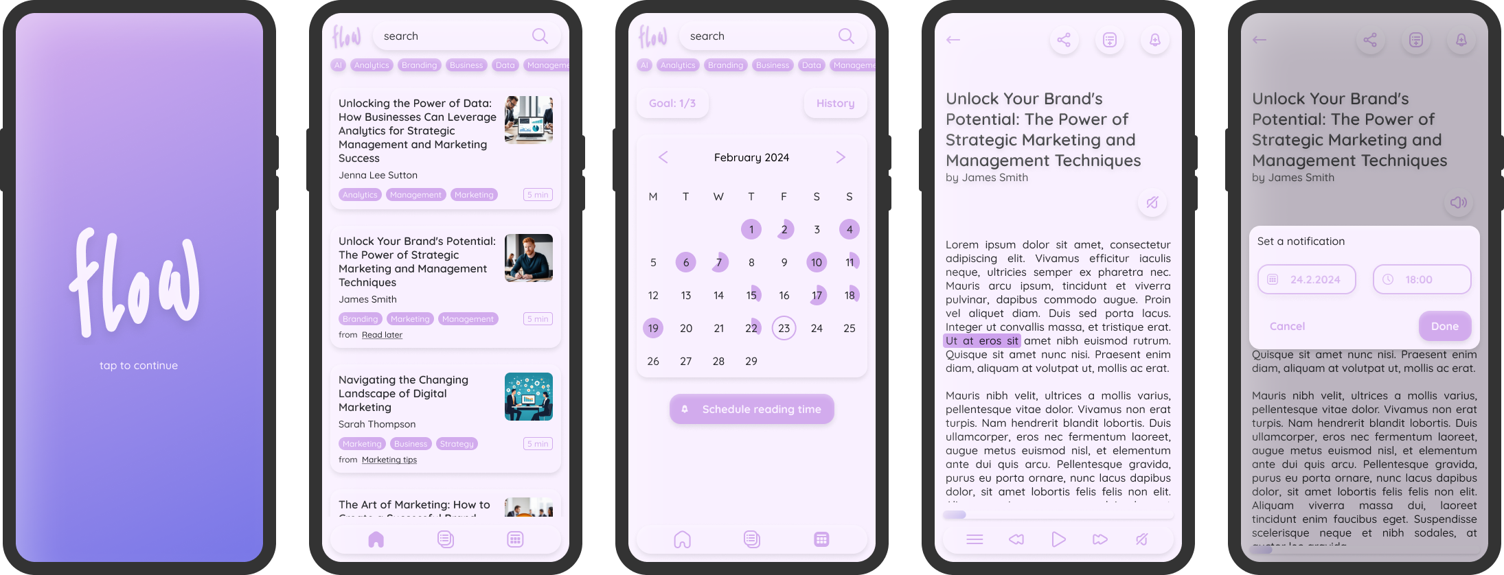
A selection of the screens of the final version of our prototype is shown in the image below. The full working prototype can be found here.
Evaluation Phase
Heuristic evaluation
Since we didn’t have any real users it would have been burdensome to find users to test the prototype. In turn, we decided to do a heuristic evaluation. This was based on the 10 usability heuristics by NN Group:
- Visibility of System Status
- Match Between the System and the Real World
- User Control and Freedom
- Consistency and Standards
- Error Prevention
- Recognition Rather than Recall
- Flexibility and Efficiency of Use
- Aesthetic and Minimalist Design
- Help Users Recognize, Diagnose, and Recover from Errors
- Help and Documentation
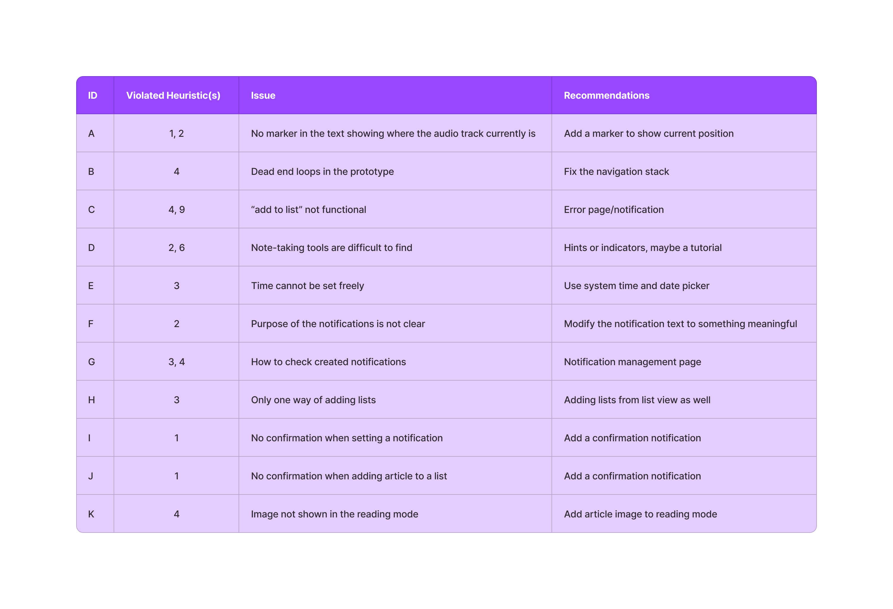
First, we decided on sequential tasks. We thought it would be relevant to complete them in a sequence as we might find issues with navigation and other things that happen between individual features. After the task list was done we agreed on the note-taking template; our template consisted of four columns: ID, heuristic the found issue violates (refers to the aforementioned heuristics), a description of the violation, and suggestions on how to fix it. After all this was decided we conducted the evaluation individually. The issues from these individual findings were gathered into a single table.
Results
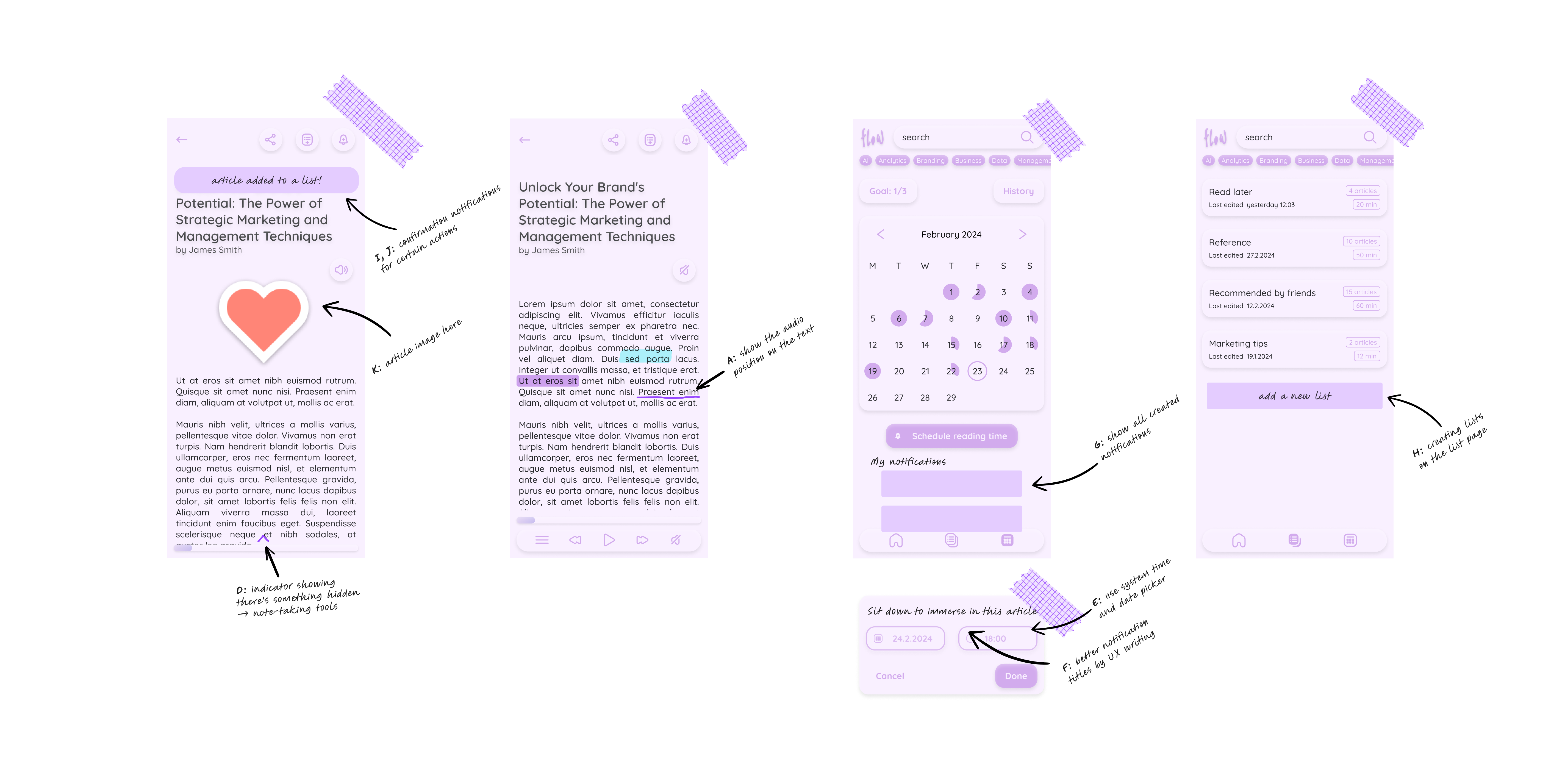
The findings were gone through together and discussed thoroughly. Our focus was on how to fix the violations the best way. We decided to organise the list based on severity to highlight what needs fixing first. After assembling all the findings into a list we went quickly through it and sketched solutions based on the recommendations. These additions did not get implemented in the prototype as we decided the MVP concept had already been reached and prototyped properly. Additionally, we created quick visualisations of the fixes that would directly affect the user interface where we refer to the violations with their respective IDs.
Future Research
To make the concept a reality, the interruption-detecting algorithm needs to be researched thoroughly. Something similar is in use in some specific cases. For example, in factory settings, something similar has already been implemented using data collection, audio analysis, and machine learning. However, in our context, the environment is expected to have more variables than in the factory example. Additionally, you could utilise scroll position and speech analysis to detect possible interruptions more precisely.
Future Features
Our concept is merely a skeleton of all the ideas we came up with throughout the design process. The current version is quite neutral with any business goals. We thought the app could be developed in many different ways to fulfil different goals; the features-to-be depend heavily on the business goals.
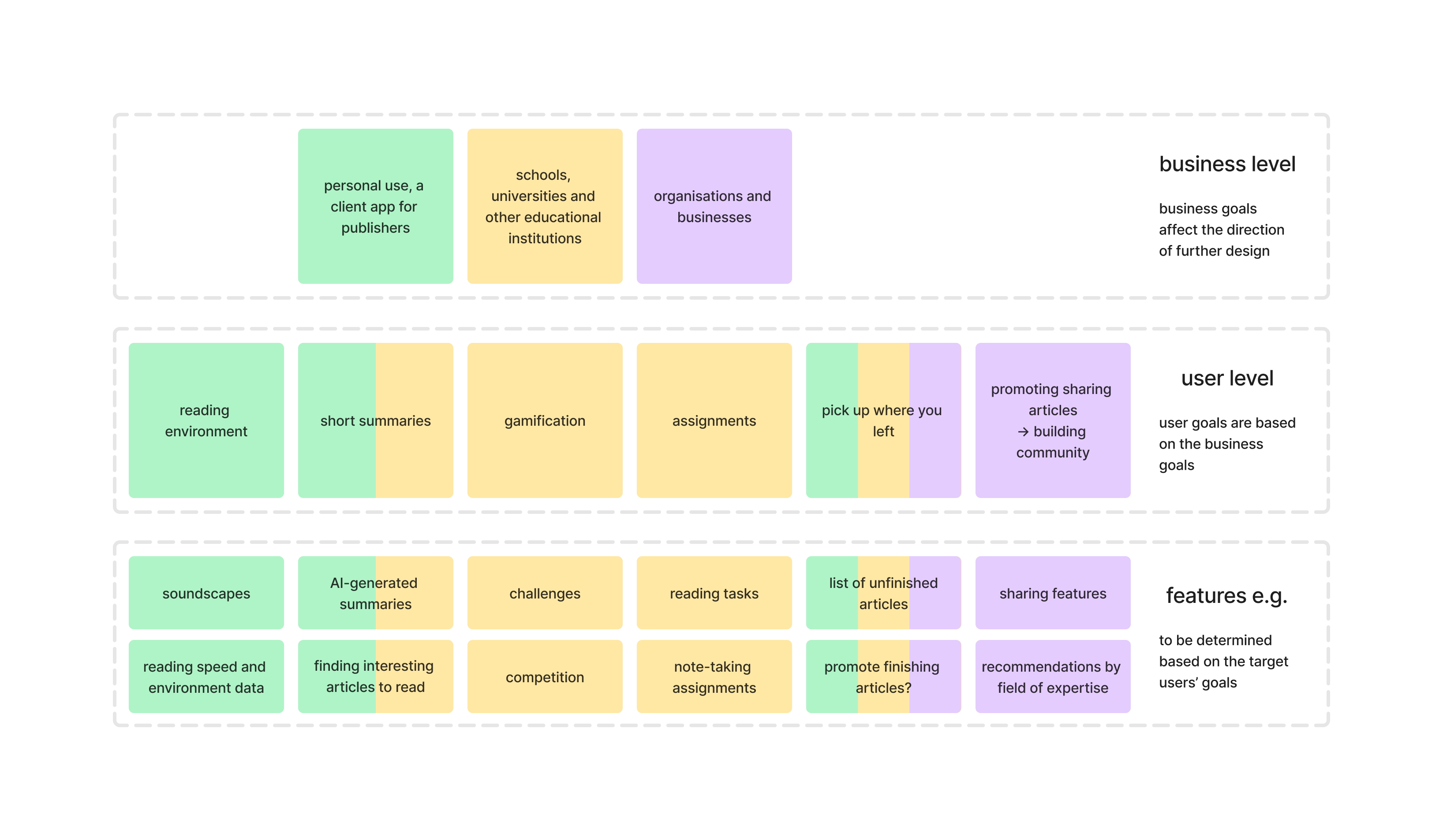
This graph illustrates different paths the app design could take. We put the remaining feature categories on the user level and colour coded to match the possible businesses and their goals. Additionally, possible features were added at the bottom to make it more tangible what the business and user goals might mean in practice. The graph is just an illustration and the real implementation would be case-dependent.
Project Reflections
When we went through the process of the project we found something valuable that kept us going and also something we would definitely do differently next time. All in all, we learned a lot and thus reached our personal goals.
Things Done Well
This project is not just a UX challenge, but also an interest project for our team. There are three things that need to be highlighted during the reflections on the process. To begin, interest brings motivation: we were active and kept a positive attitude for this challenge. When we addressed any problems, we were effective and proactive in finding solutions.
Followed by our flexible schedule and punctual team rules, the former is beneficial to ensure we are productive when we have project meetings, while it also caused some postponement since we needed some breaks. The latter is a valuable rule for teamwork; when everyone is on time the project can proceed properly.
Last but not least, writing things down is a good habit for design work. Commonly, designers have a bunch of insights during the design process, while some insights were out of the box but still valuable at that time, writing them down would be invaluable. To be specific, those fragmented ideas could contribute to the next iteration of design or even to a new project, like in our case.
Things to Improve
We mutually believe there is no perfect design but a better design. Based on the reflection of the process, we found several aspects that we could do better on the next project. Firstly, the blueprint plan and time frame could need more clarity and certainty. We had plans for each phase, but not a top-level schedule for the whole challenge. Due to this situation, we almost downplayed the evaluation phase, lost track of time, and deviated from setting results and values. It would be better to pay more attention to this the next time.
Secondly, increased prioritization of documentation would be good for showcasing our design thinking, at least for portfolio projects like this. At the beginning of the project, it is better to note what should be written down for the case study. Planning the writing schedule is necessary because we found documentation is our weakness, and we believe a practical writing schedule is an approach to help us overcome it. Maybe even designing the whole process around documentation might prove fruitful.
Thirdly, it deserves to put more effort into the evaluation phase. Evaluation is an essential phase for the iteration of products, building on our design process, learning deeper about evaluation methods and plan evaluation at the beginning would improve our design skills.
Lastly, leveraging user personas more effectively. During the project, we created a persona with 4 user goals, while the project met 2/4 of the user goals. We failed to consider persona fully during the design phase, which is not ideal during design. Paying more attention to persona could help in design decisions and user-centred design approaches.
Effectiveness of the Design
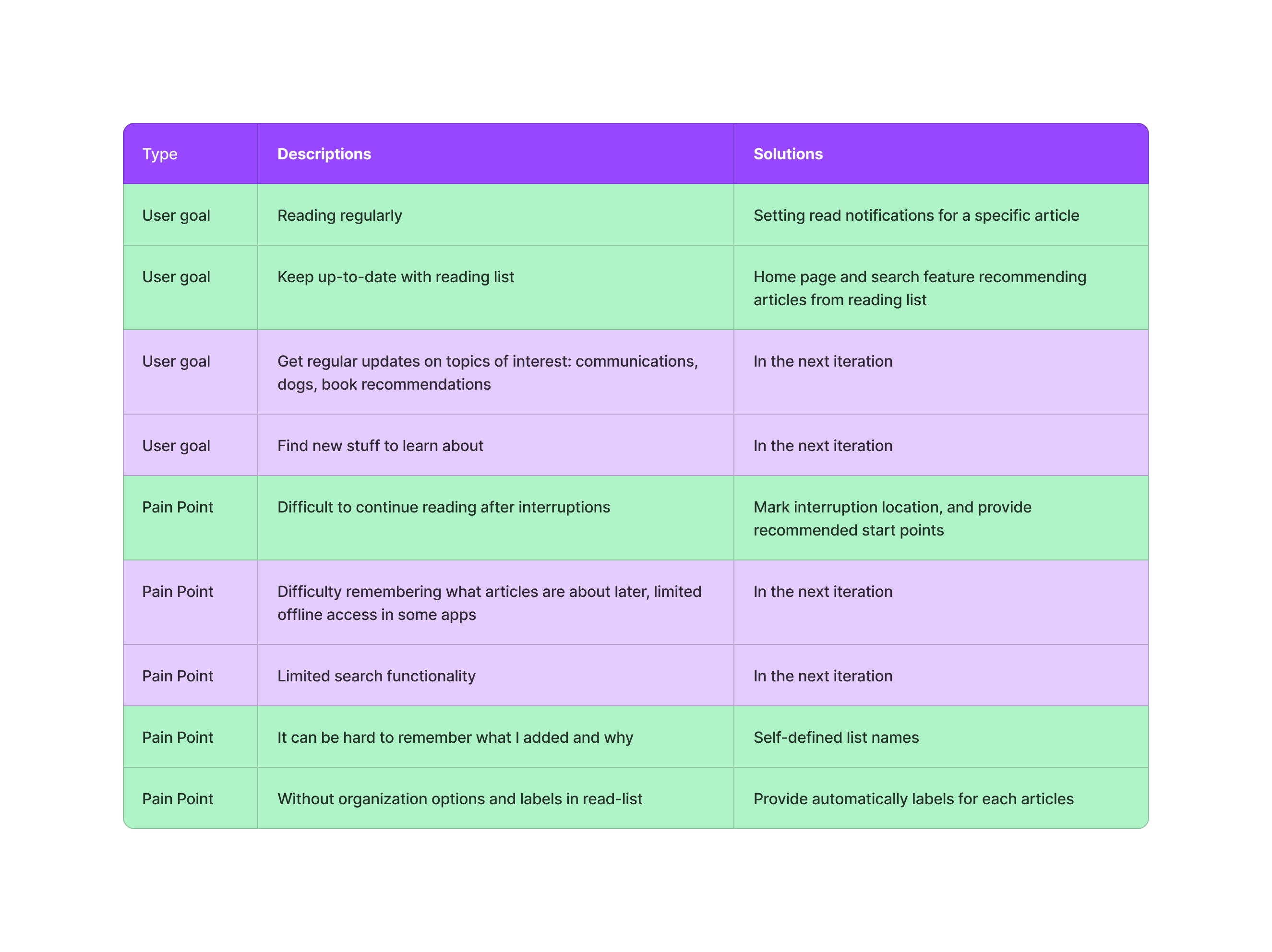
In this first iteration of the project, we met 2/4 of the user goals. The product can help users read regularly by setting reading notifications and getting back on track after any interruptions. The solution also highlights the contents of the reading list by recommending articles from there on the home page and in the search. In addition, we solved 3/5 of the pain points in the MVP product and are ready to solve the rest in the next iteration of the design. Below, is a table of user goals and pain points. The rows marked with green are solved and the rest remain to be addressed in future iterations.
Values of the Design
For users who read or listen to articles on the go, this design provides interruption detection and management is an advantage for users to catch up quickly after interruptions. At the same time, this might bring potential users if the primary users recommend some interesting articles to their friends. The reason behind this is new articles might spark motivation to read more or get new knowledge and also provide more topics to discuss within their social circles.
For companies, institutions or schools our solution could be beneficial in a way. To give an example, at school, some assignments related to reading books, a potential usage is that teachers may break a book into small sections and assign daily tasks to students. If students are fast readers and willing to read, the product could recommend similar articles or books to them. Additionally, the product could log the interruptions that help students catch up, especially under their vacation plan. Moreover, this might help diagnose dyslexia or other problems that hinder reading. As for the companies and institutions, this product could help them receive the reading data and user group analysis. That could help them to adjust publish strategies to attract more users.