Project Overview
Challenge
In a nutshell, this project is about exploring ways of visualising environmental factors with XR for guiding people towards more sustainable habits. In more practical terms, me and my team welcomed this challenge and designed an app concept that makes grocery shopping easier while promoting sustainability.
Our solution enhances the grocery shopping experience by calculating the optimal path and showing sustainability-related data in real time. EcoScan is designed to help all customers while awarding for better choices.
Objectives
- Visualise sustainability in a meaningful manner
- Deliver a concept that uses AR
Project Scope
HTI Research and Innovation, Hi-Fi Prototype
Role
Project Manager, UX Designer, UX Researcher, Visual Designer
Team
Self-directed, with feedback from the teacher
Tools
Figma, FigJam, Zoom, MS Office
Duration
15 weeks
Design Process
Research & Ideation
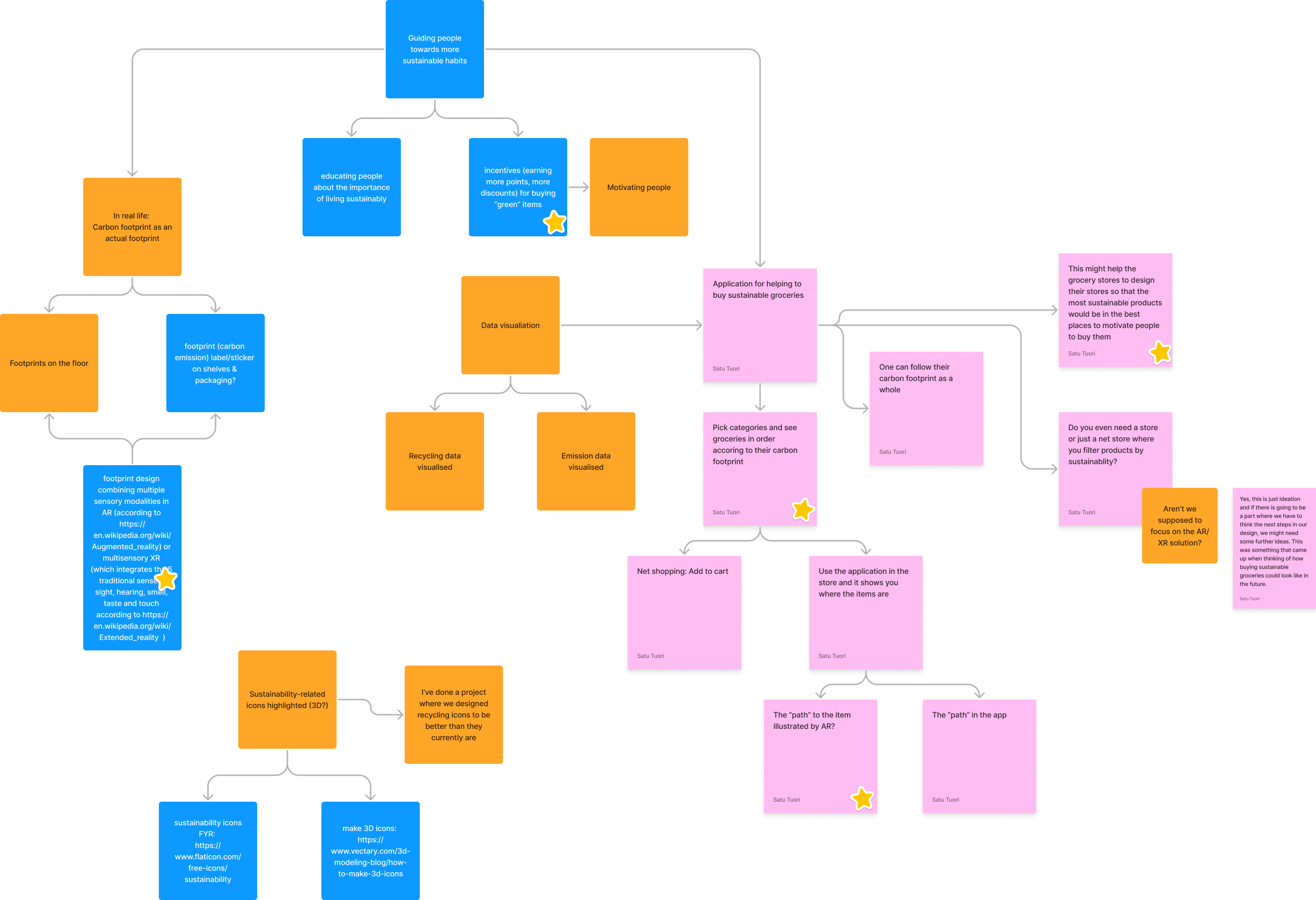
After the usual introductions and setting up project boundaries, we jumped straight into brainstorming and ideation. The graph above shows our starting point. Finding justification for our design decisions, we conducted a literature research by reviewing eight related papers and benchmarked existing solutions. Of which the most papers were Nudging more sustainable grocery purchases: Behavioural innovations in a supermarket setting and PHARA: an augmented reality grocery store assistant. Reviewing these studies gave us ideas for the user studies.
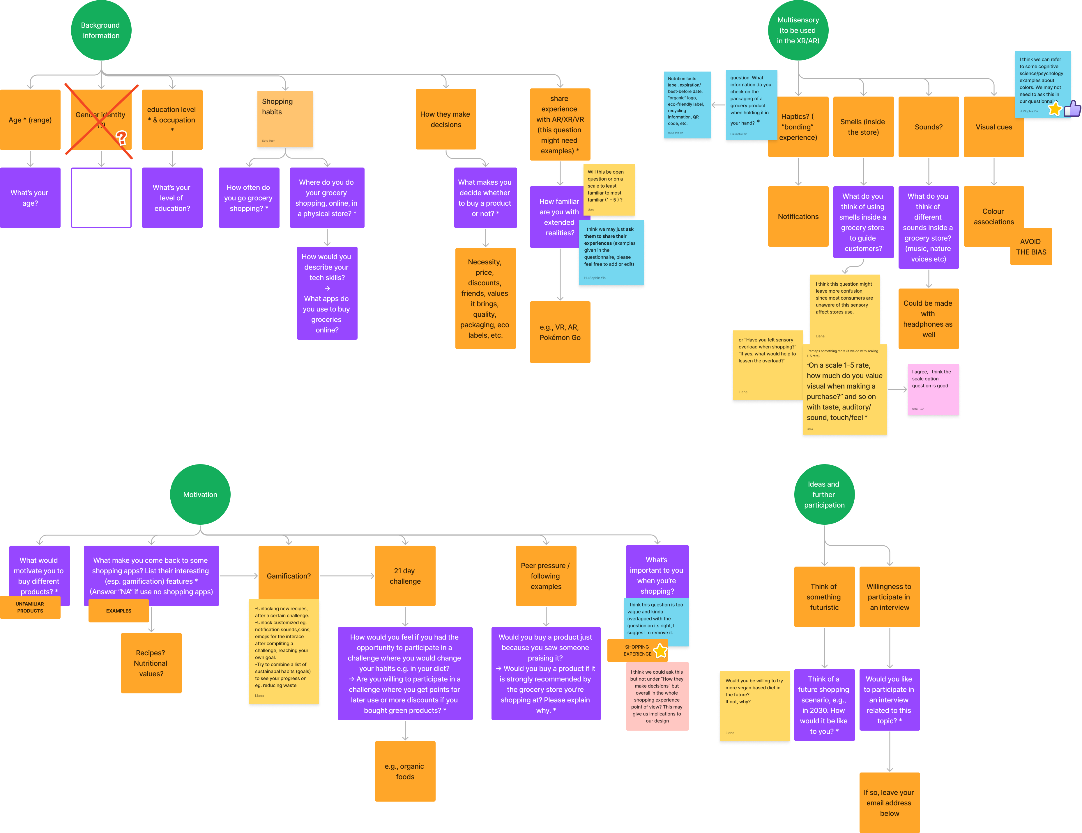
Since the previous brainstorming session was fruitful, we used similar approach to designing the user studies. Above, you can see the interplay of FigJam notes forming a somewhat cohesive overview what should be included in the user studies. First, we decided to scope possible participants with an online questionnaire which got 19 responses. Out of those, four expressed their interest to participate in interviews.
Building User Emphathy
Based on the all aforementioned research, we built two user personas. The first one, Outi, is a typical university student with a low budget to spend on groceries. The second one, Pekka, is a parent of two kids working as an engineer. While more or less similar, we decided to have two personas as we found having kids has a strong influence on grocery shopping habits.
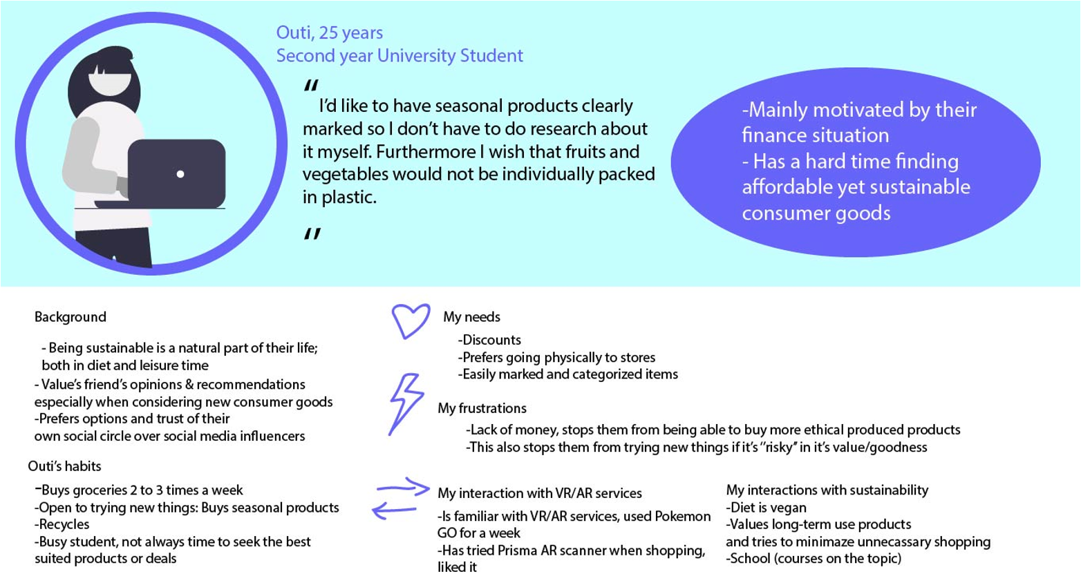
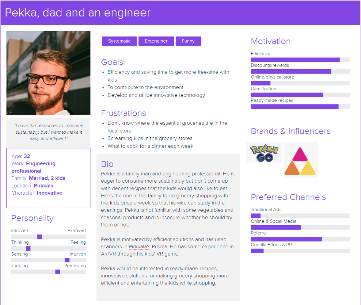
It was evident at this point that kids accompanying their parent to the grocery store are secondary users and thus need to be taken into account in the design. These personas were used in the monthly presentations we gave about this project. From here, we proceeded to designing the features and views list.
Design & Prototype
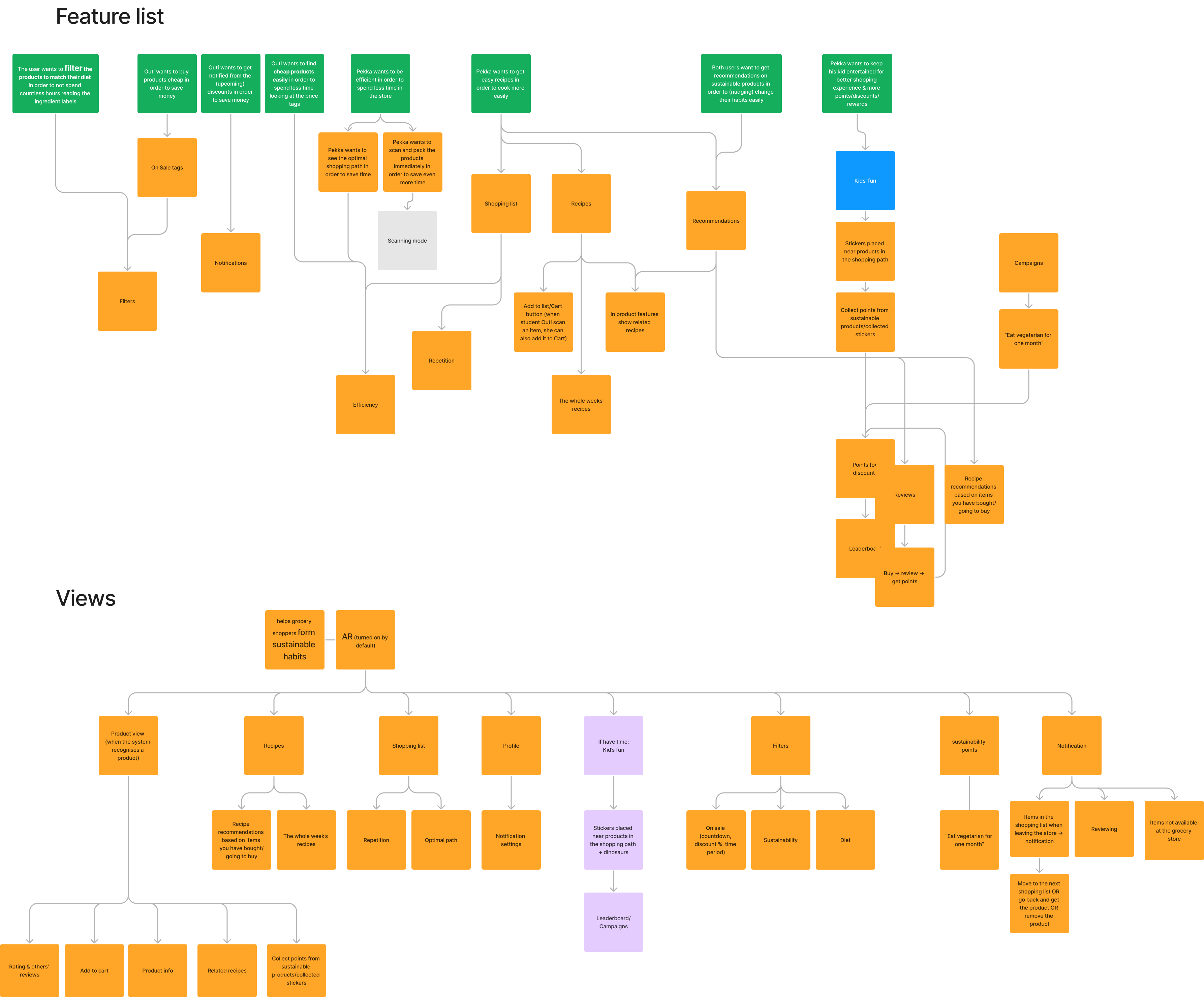
As mentioned, kids affect greatly the sopping experience of parents. The views and features are illustrated in the graph below. We separated "Kids' fun" from the rest by colour coding it. The feature was renamed as "Kids' Mode" and I'll be referring it as such. After a lot of discussions about how we should proceed and taking the scope of our project into account, we decided to drop the Kids' Mode and focus on the core functions of the app. Nonetheless, our task was to illustrate sustainability with AR.
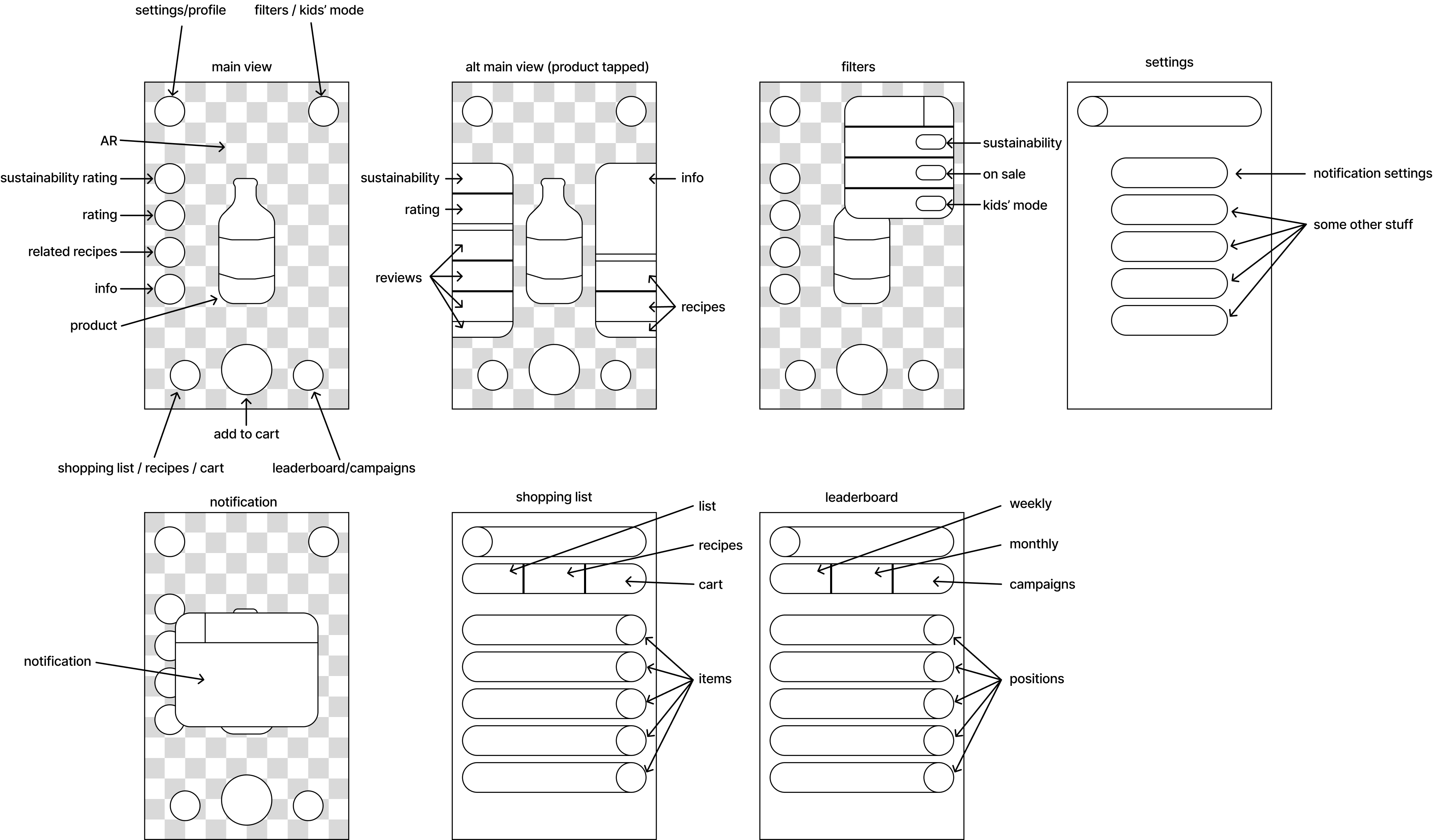
The graph above was quite straightforward to convert into a wireframe as shown below. This wireframe was updated with more finished screens and ultimately created a basis for the hi-fi prototype.
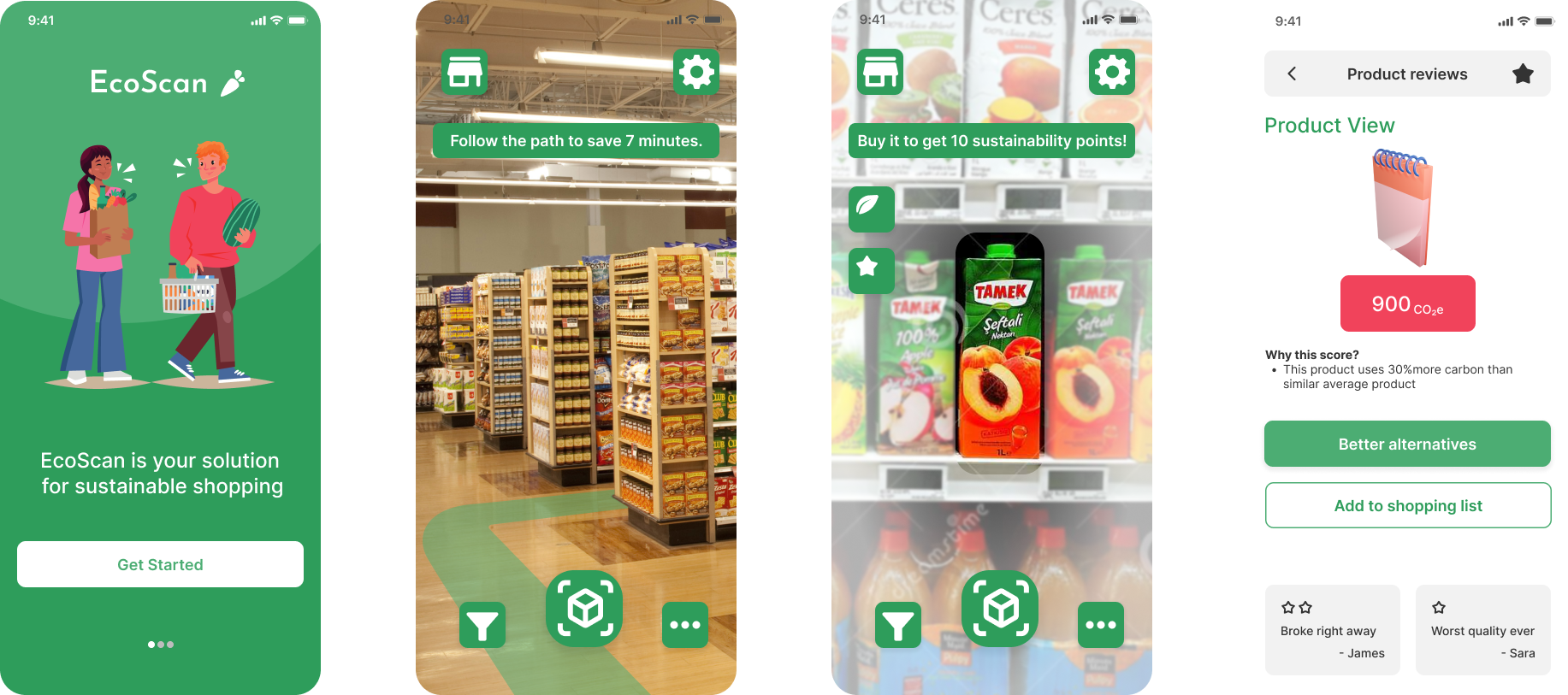
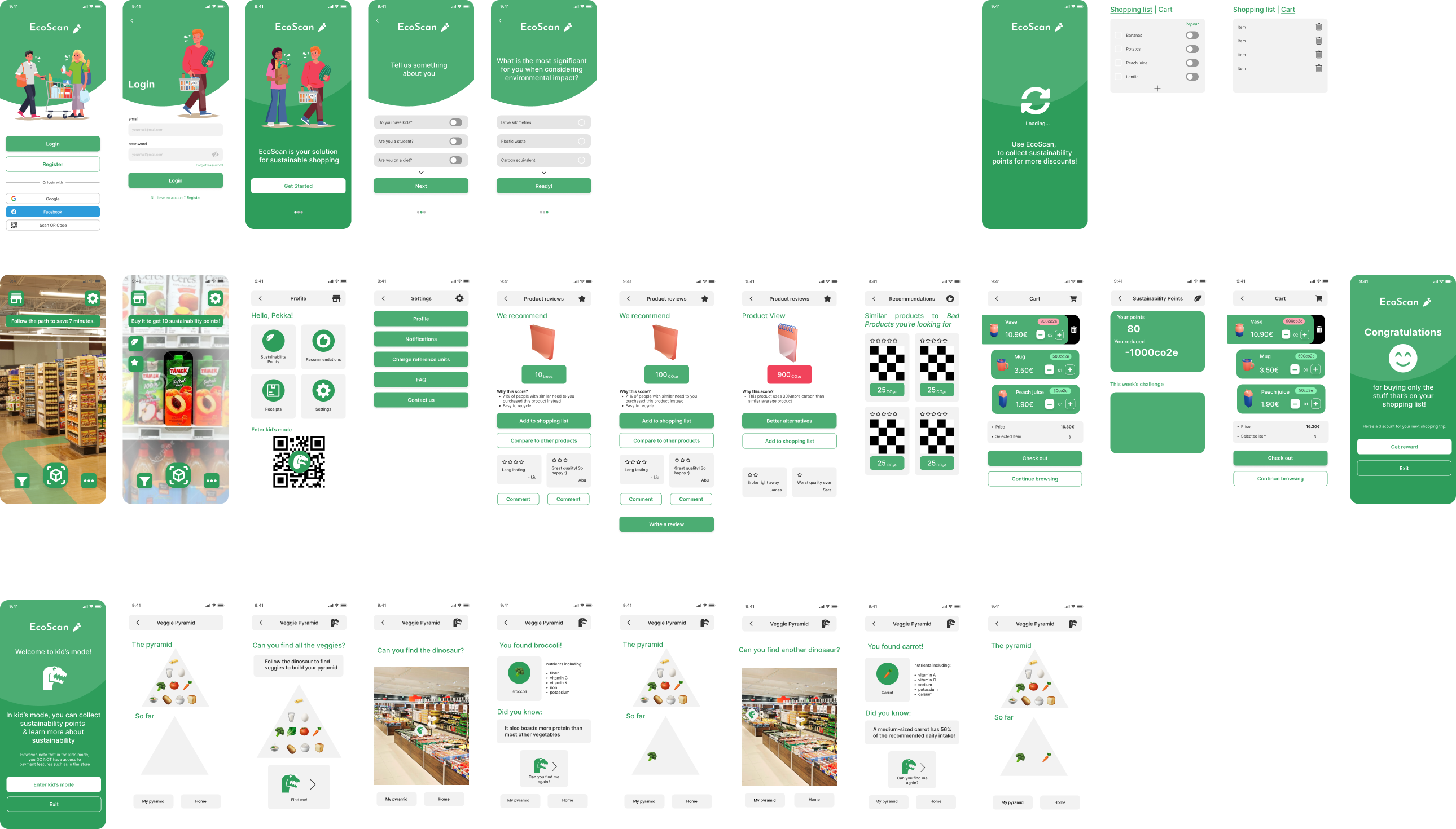
Our design, EcoScan, is an app that helps any customers. Its main feature is the optimal path visualised in AR. This is illustrated below, the first two screens on the second row. The path is derived from the user's shopping list. When approaching a product, the product is recognised through image recognition and the app shows the sustainability information along the reviews of the product. The user can scan the product with the app and pack it right away. Below illustrated are the screens of the final hi-fi prototype we created. We included the features listed but the visual look is not perfect. More about that in the reflection.
As you can see, we still included a rough version of the Kids' Mode. This was done as we had some spare time before the deadline and handing out the project. This feature is only a one-direction lo-fi prototype illustrating how EcoScan could be used by a kid accompanying their parent.
Test & Iterate
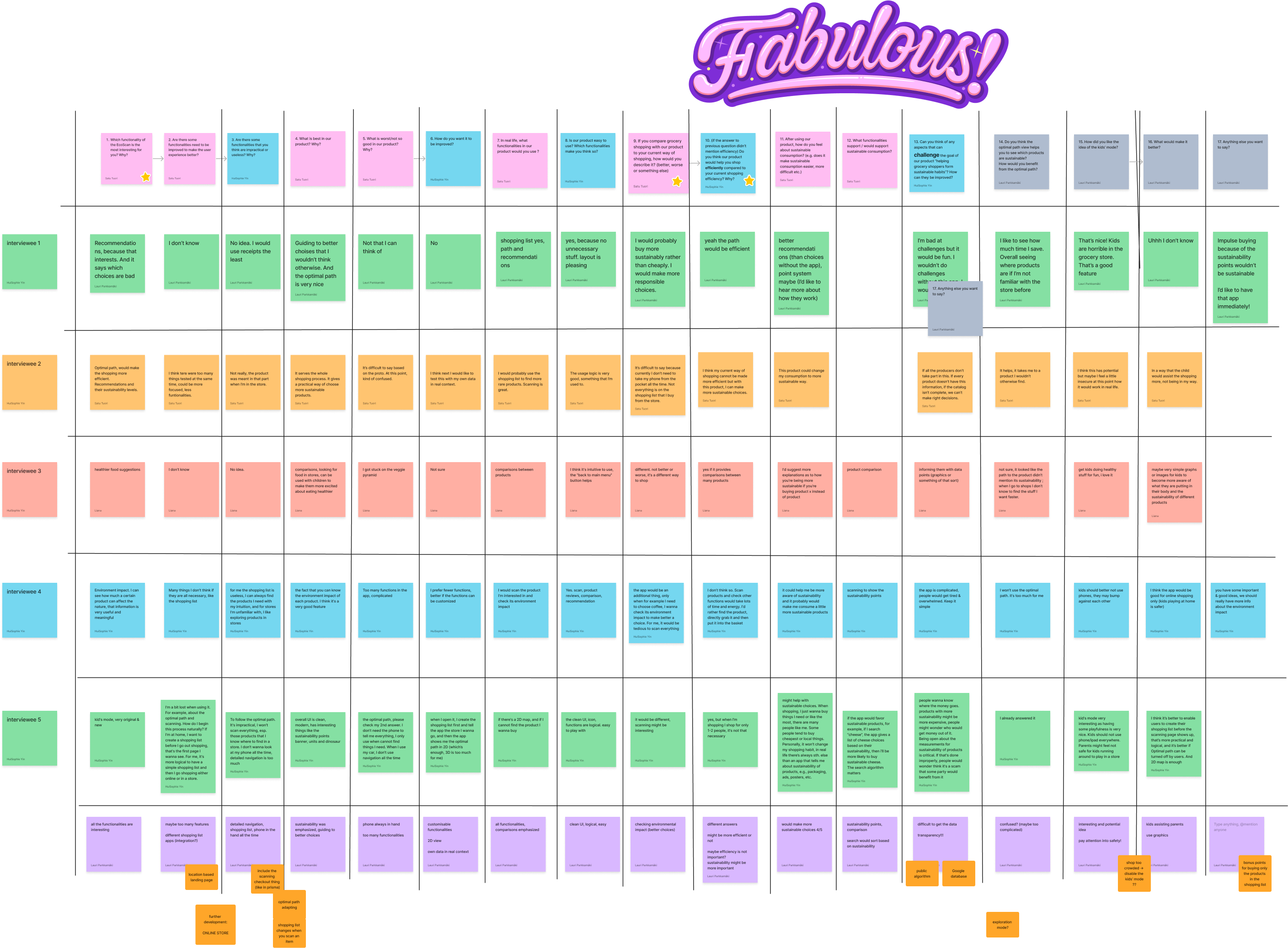
Another quick round of interviews were conducted with the participants who participated in the previous interviews as well. We collected the responses to the table below and together discussed what the answers meant. The conclusions were written down on the last row. The next thing would be to take these insights into account and revise the design but our scope ended here.
We summarised the most important upcoming features: sustainability points, recipes integration, and kids' mode. First, implementing sustainability points, as an incentive towards sustainable habits, was discussed previously but it seemed to require so much research to implementing it meaningfully that we decided to leave it out for now. The implementation of a such feature would open doors for gamification features. Second, there are already an overabundance of recipe providers so our idea was to utilise existing providers to quickly add the ingredients to the shopping list. Last, Kids' Mode seems like an interesting an important addition to the design. It needs to be studied how we could design a system that kids would enjoy and make the shopping experience for the parent more pleasant. These are features we didn't implement and left for future iterations of EcoScan.
Lessons Learned
Thorough literature review in the beginning is worth the effort although it might feel like a burden - I'm guilty of procrastinating on that too much. During this project, I tried to find reasons for why I have this behaviour and came to the conclusion I'm personally more practice-oriented as a designer; I strive more in brainstorming and testing different solutions.
Do not try to do one-app-to-rule-them-all. Since our team was full of ideas, it was difficult for us all to decide which ones to focus on. I personally learned that it's better to have too much ideas initially and chip away until the idea fits the scope. It's good to prioritise features and create the MVP design first.
Scarcity of tools is a virtue; having everything on a single FigJam file makes it difficult to forget or ignore insights and what has previously been discussed. Moreover, a visual schedule helps understand the schedule better. Literally seeing the deadline getting closer gives a good perspective on how much time is left.
Perfectionism needs to be put aside sometimes. The focus of this project was not visual appeal but, nevertheless, I got frustrated when others didn't follow the visual style I created early on. I had to choose whether to fix it or leave it. I chose the latter although it felt uncomfortable at first. However, not following the visual guide or best practices on prototyping with Figma, it makes it more difficult to continue the project.